I am graphic designer with a focus on digital marketing design and motion graphics. Always up to new challenges, keen to learn, and never shy away from asking those "stupid" questions.
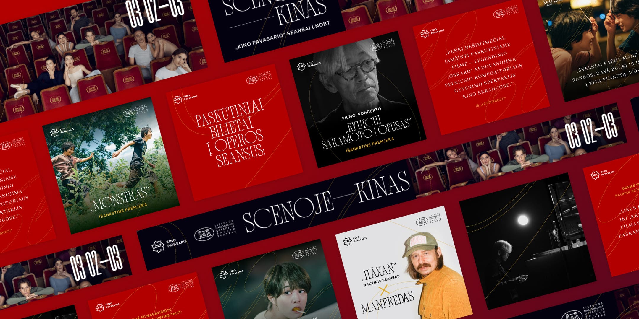
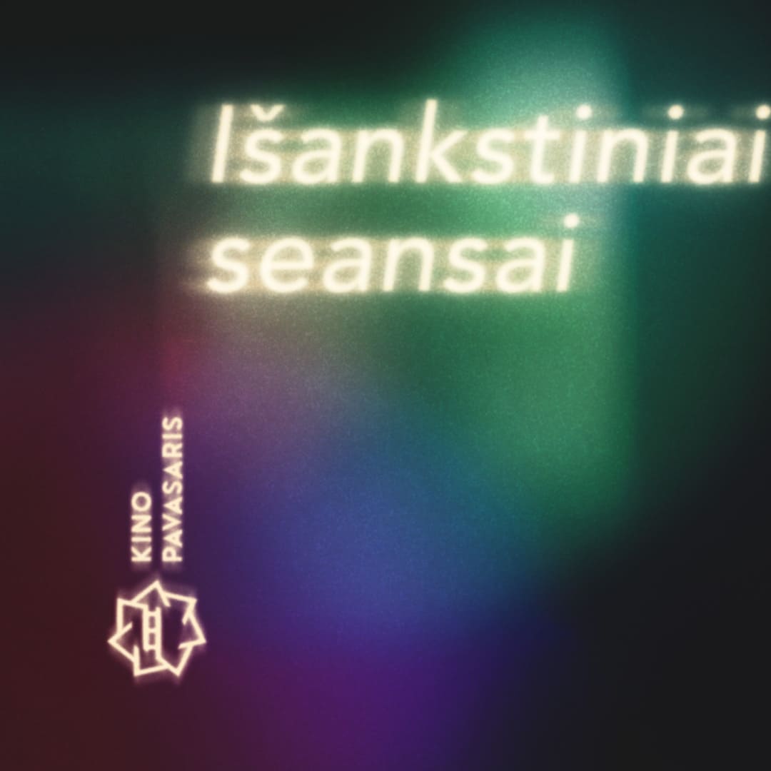
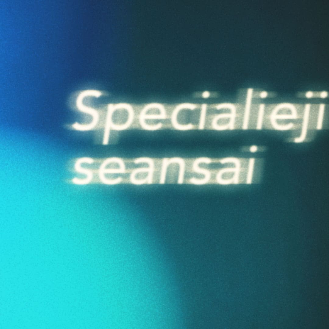
Kino Pavasaris, also known as the Vilnius International Film Festival (VIFF), is the largest cinematic event in Lithuania. Established in 1995, VIFF showcases a diverse selection of films from around the world, including features, documentaries, and shorts. It aims to promote film culture and foster international collaboration. The festival offers various programs, including competitions, retrospectives, and special screenings. I had the opportunity to work on all digital assets for the 29th edition of Kino Pavasaris/ VIFF. As a digital designer, I was responsible for conceptualizing and creating visual identities for several early-bird screening campaigns, including those at the National Opera and Ballet Theatre. However, the majority of my time at the festival was spent designing social media content and advertisements, both before and during the event itself.
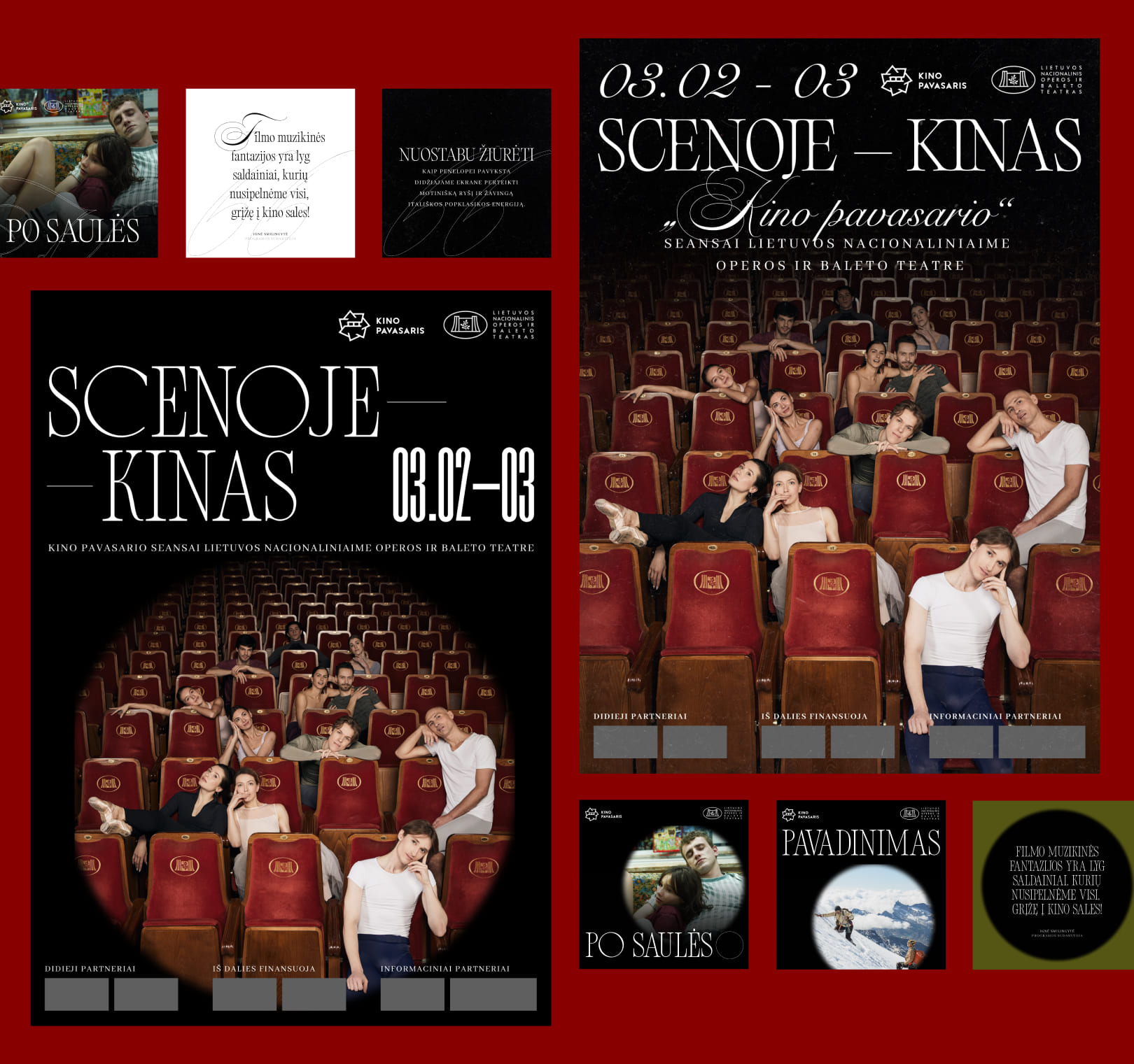
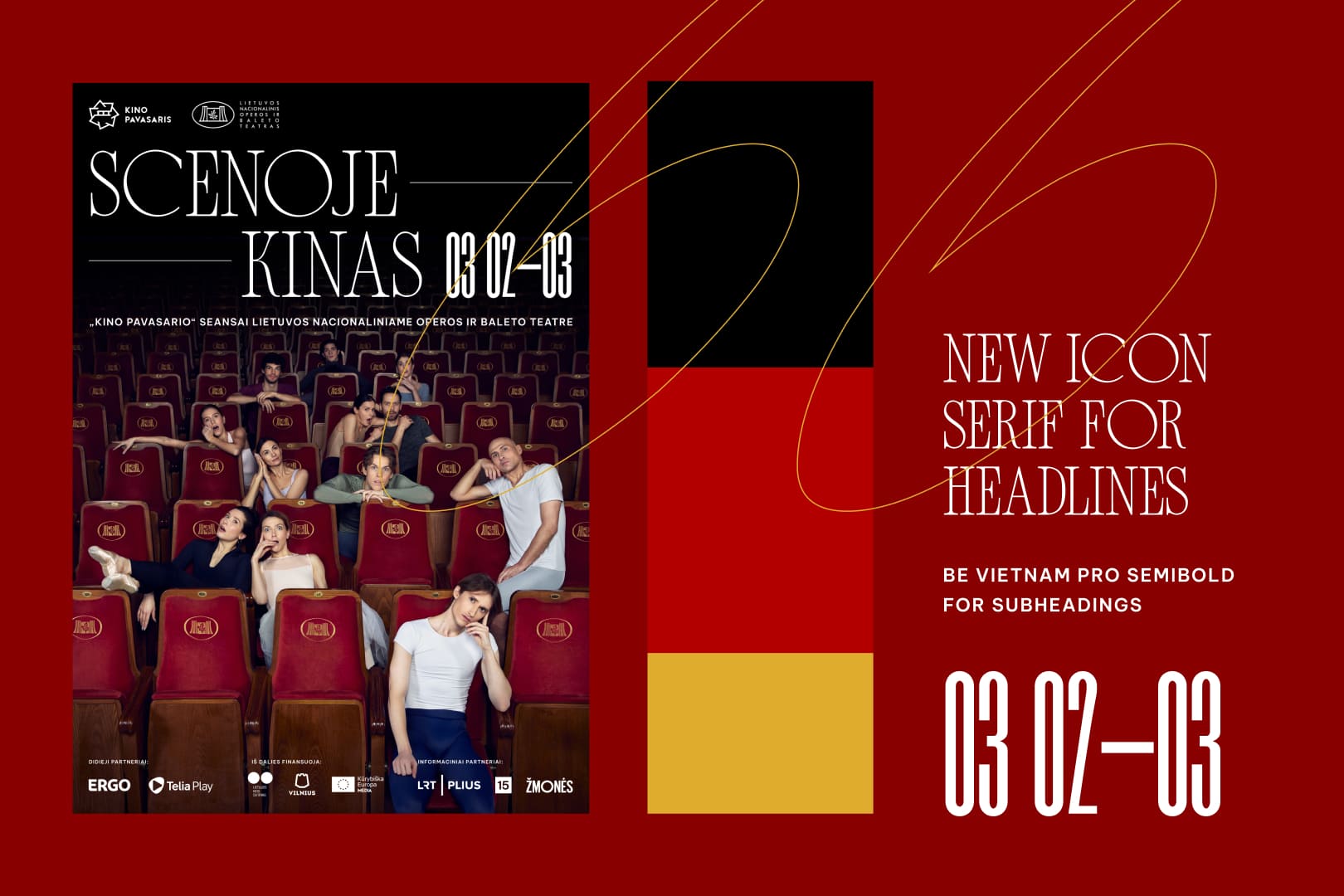
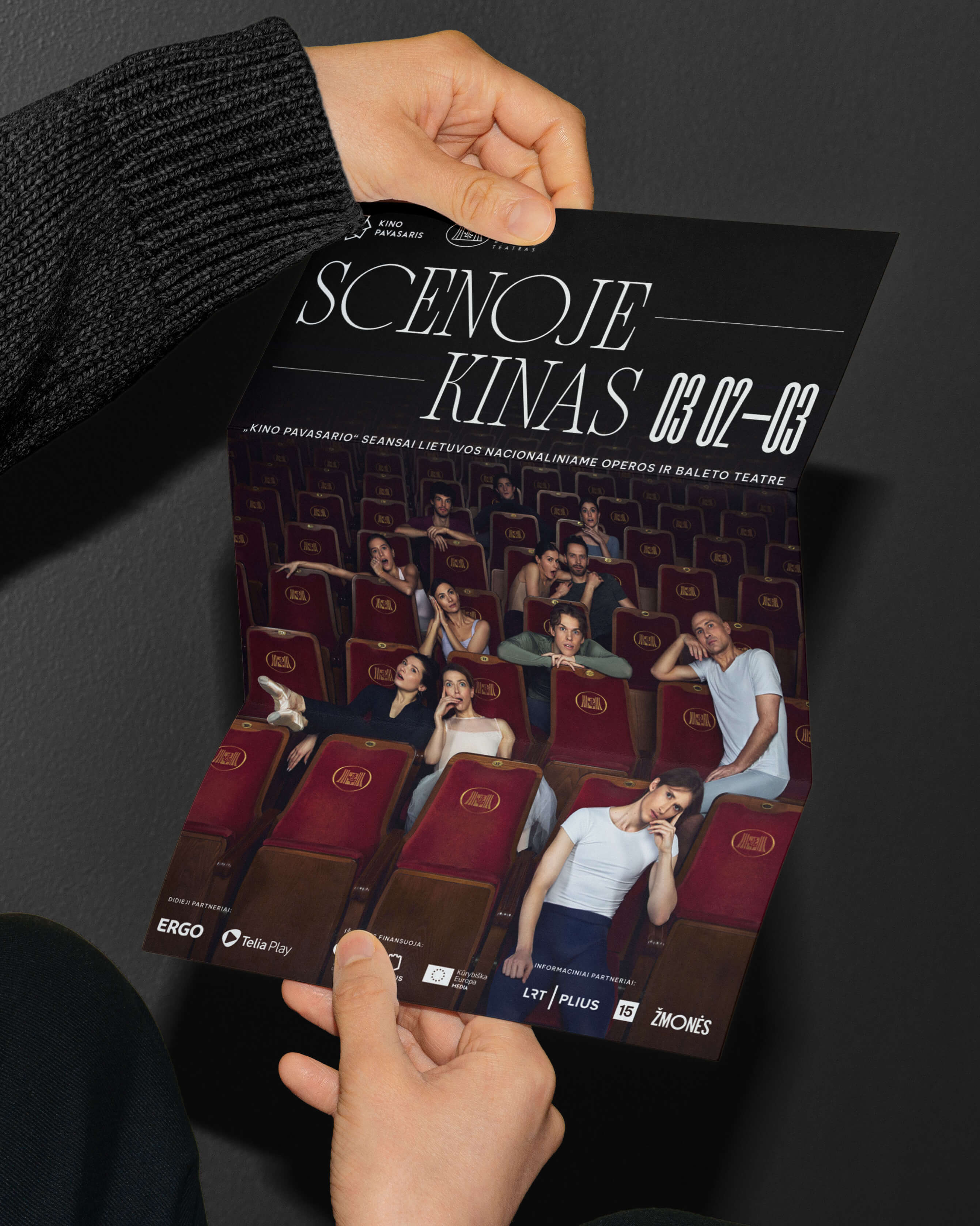
Visual identity for early-bird screenings at the National Opera and Ballet Theatre
Explorations, moodboard
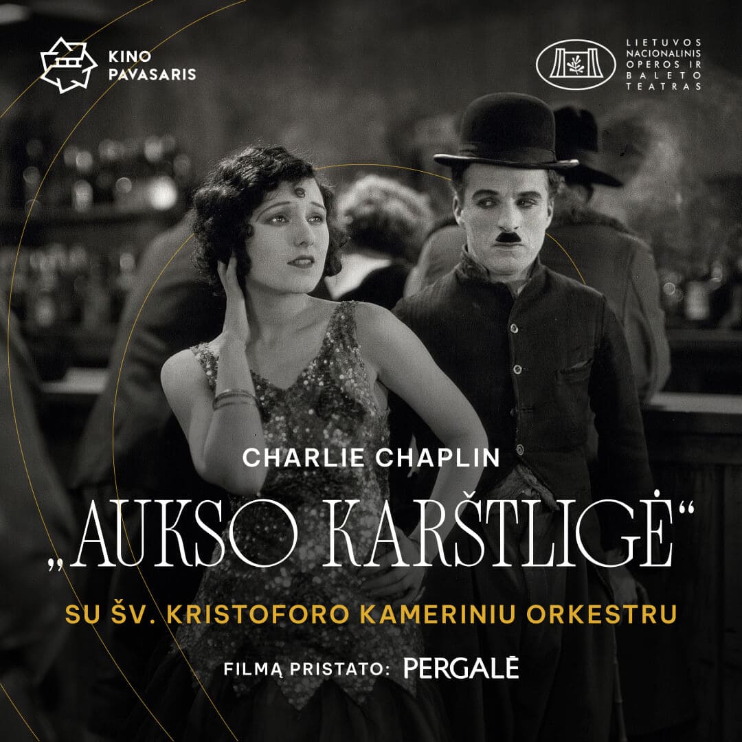
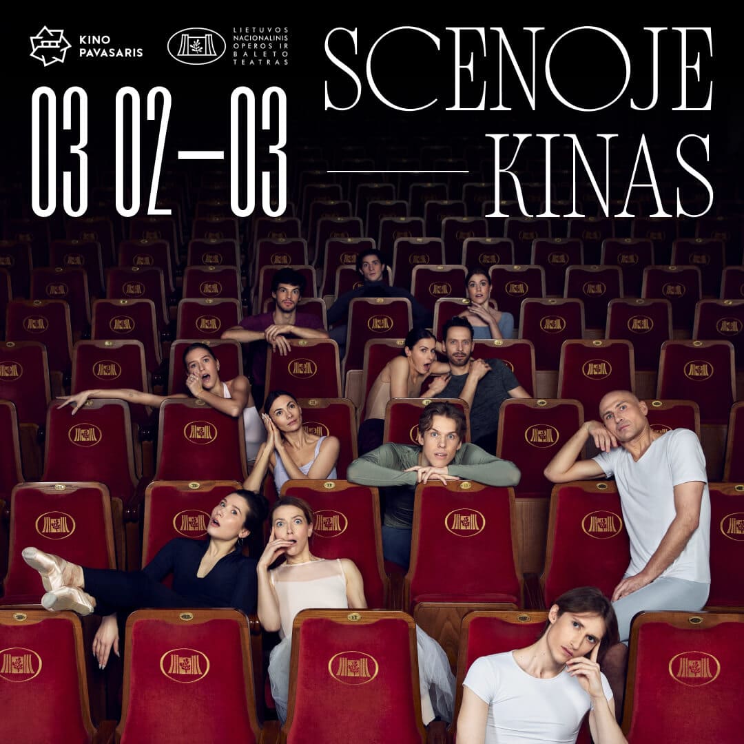
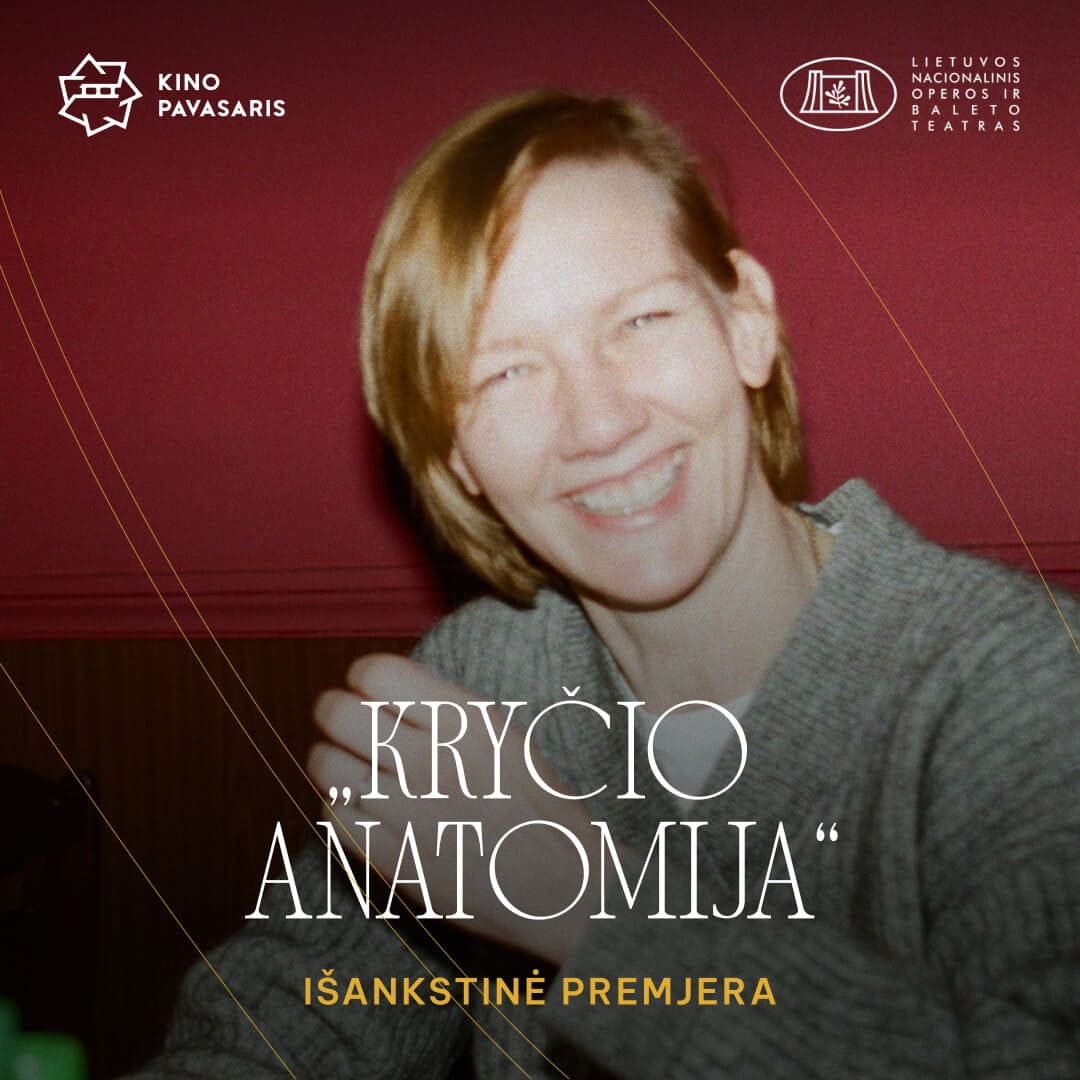
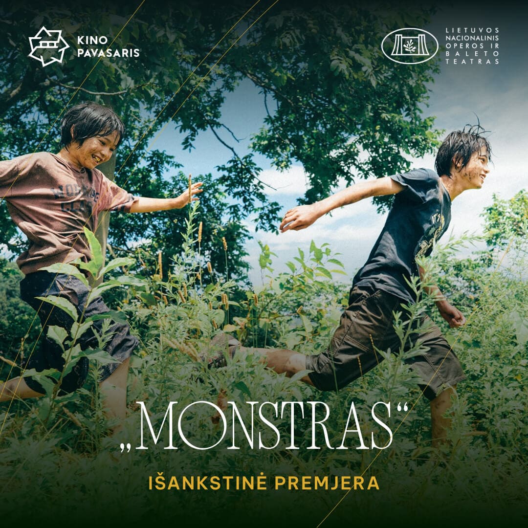
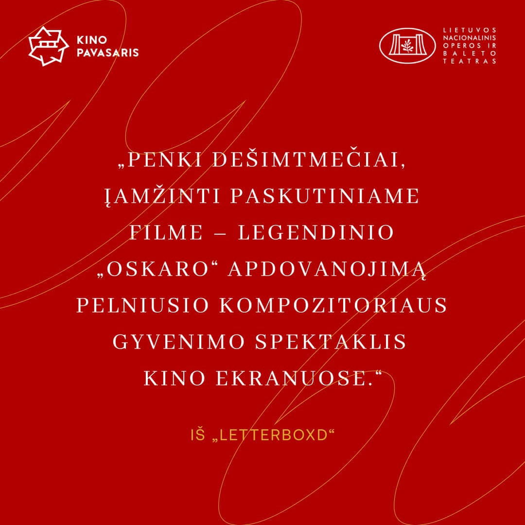
“Scenoje – kinas!” (Cinema on Stage) was the slogan for Kino Pavasaris 2024 early-bird screenings held at the National Opera and Ballet Theatre. This special program featured four film screenings, including Charlie Chaplin’s classic "Gold Rush", accompanied by a live score performed by the St. Christopher Chamber Orchestra. Shown in one of Lithuania’s most important cultural venues, the films took on new dimensions, transforming into a memorable experience for the entire city of Vilnius. Together with the team, we drew inspiration from early 20th-century movie title designs and the Theatre itself. I proposed two directions: one elegant, using abstract linear forms to echo the fluid movements of ballet dancers and musicians; the other, minimalistic, with a spotlight as the central visual motif. In the end, we decided to merge both concepts into a more subtle and balanced visual approach.
Final design
The final visual identity brought these ideas together through the use of a retro-inspired serif font paired with abstract yellow lines, symbolizing the movements of dancers and musicians mentioned above. To further connect the concept, I integrated the spotlight motif into the typography, allowing the font itself to carry the sense of 'illumination'. The main color became rich red, drawn from the theater’s iconic carpets, velvet chairs, and stage curtains. The palette was enhanced with golden accents that added a sense of elegance and timelessness. Together, these elements created a cohesive identity that felt both classic and contemporary, perfectly suited to the grandeur of the National Opera and Ballet Theatre.
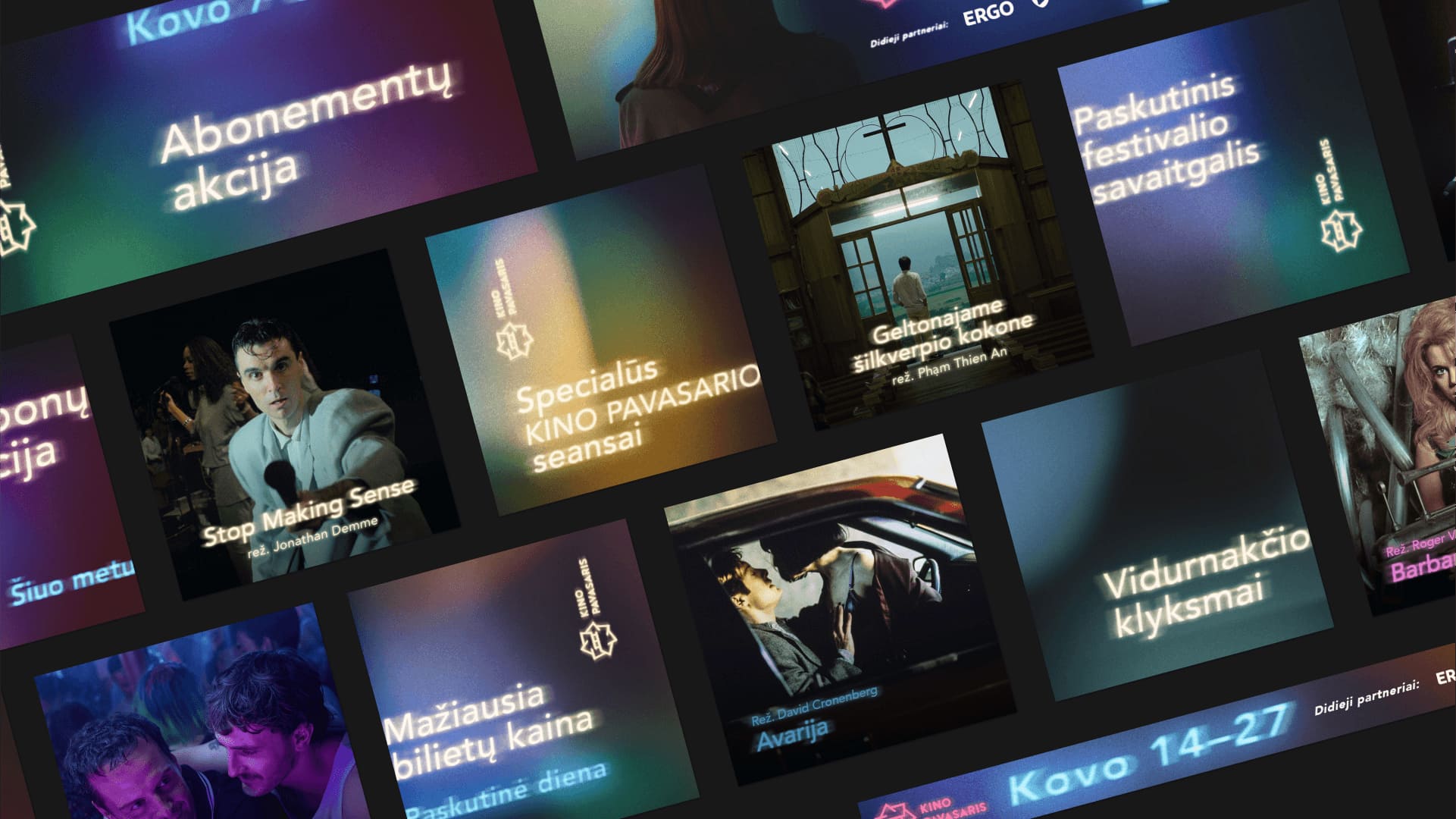
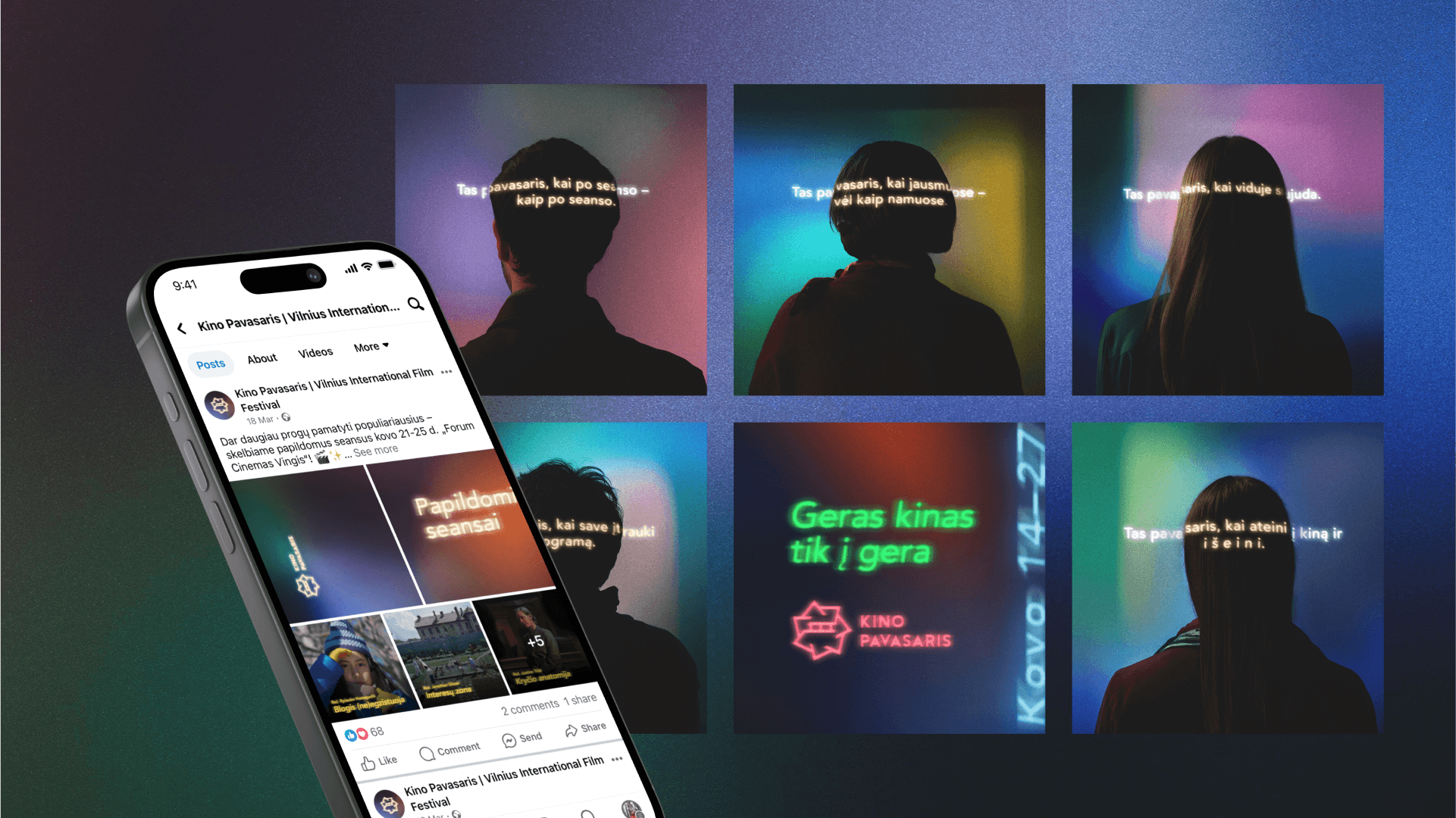
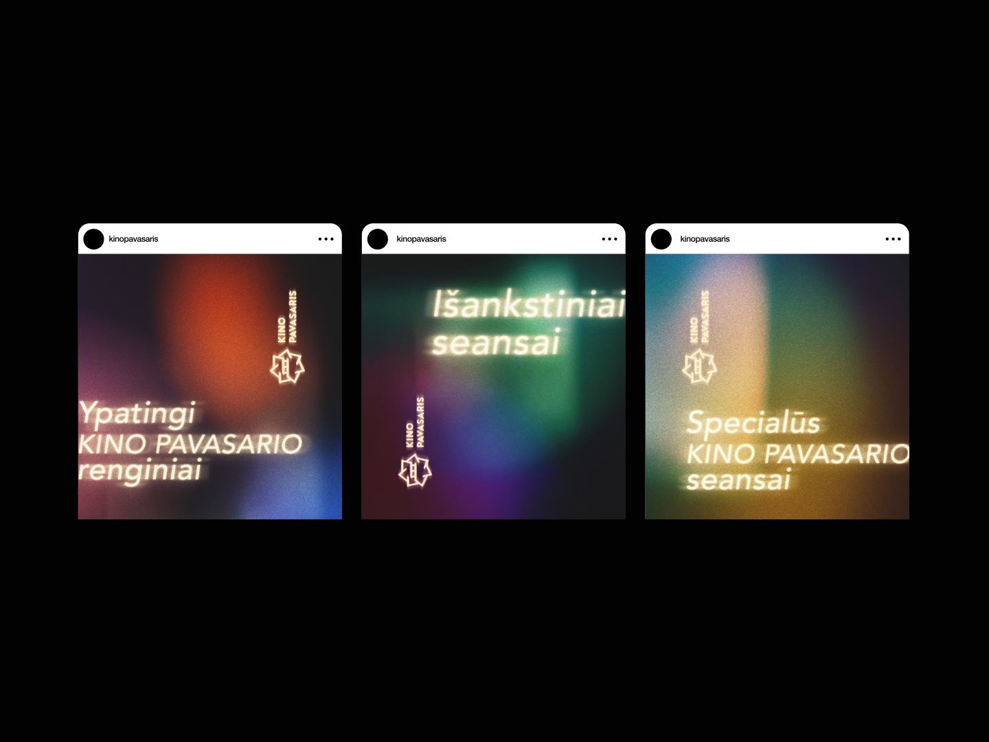
Main event
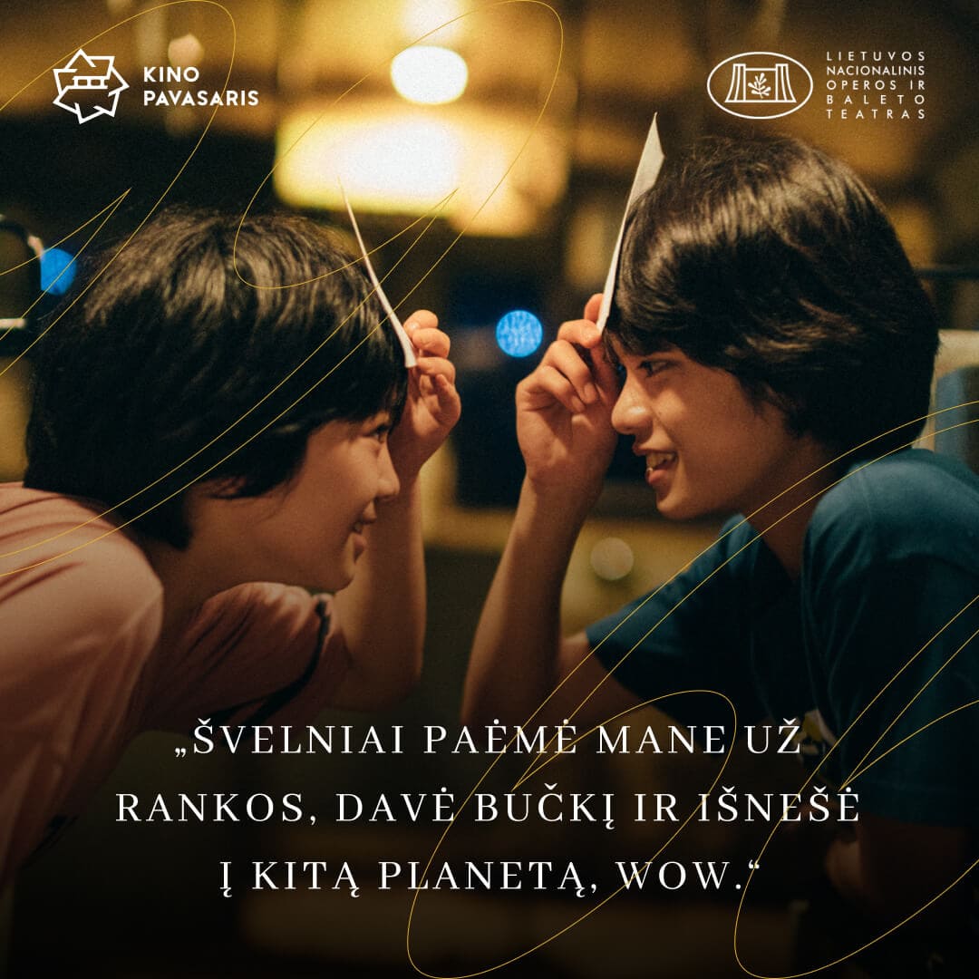
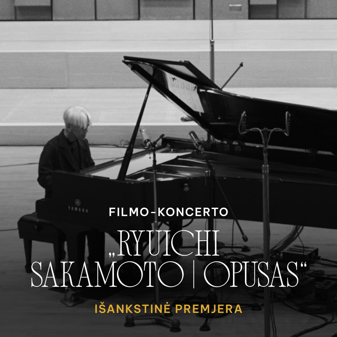
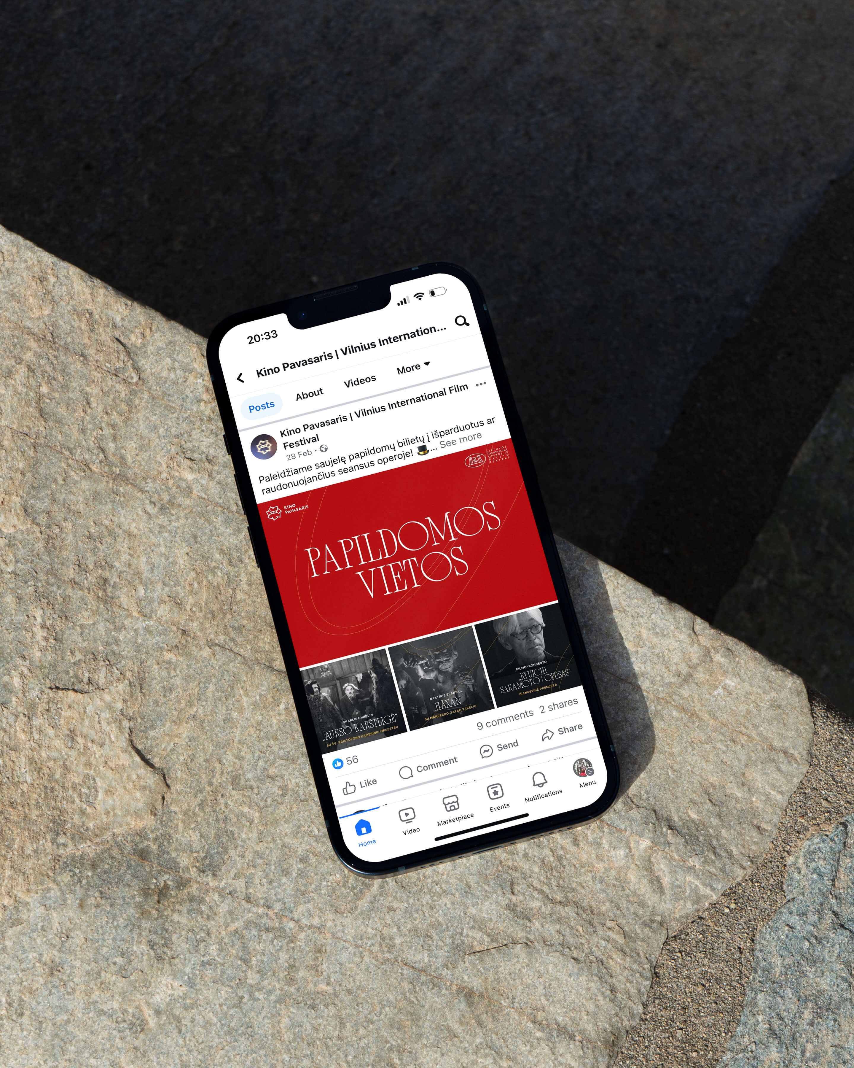
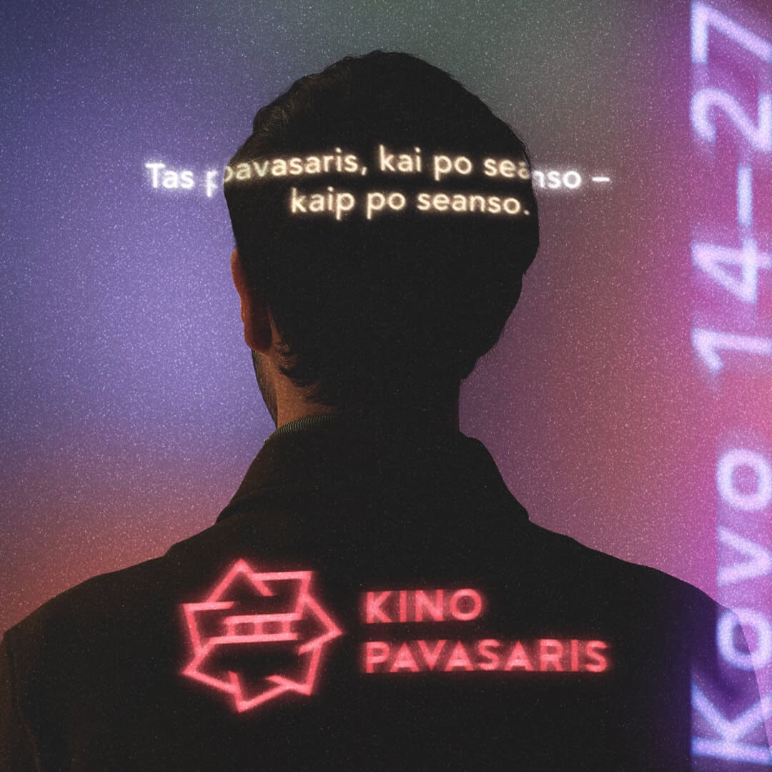
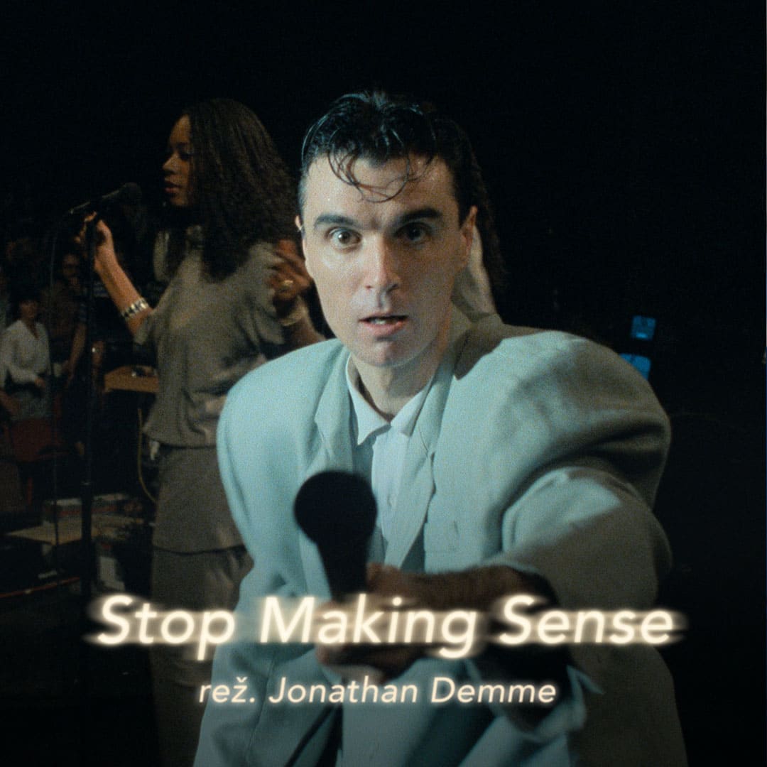
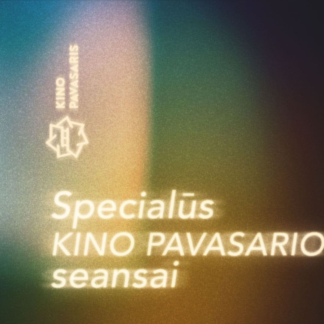
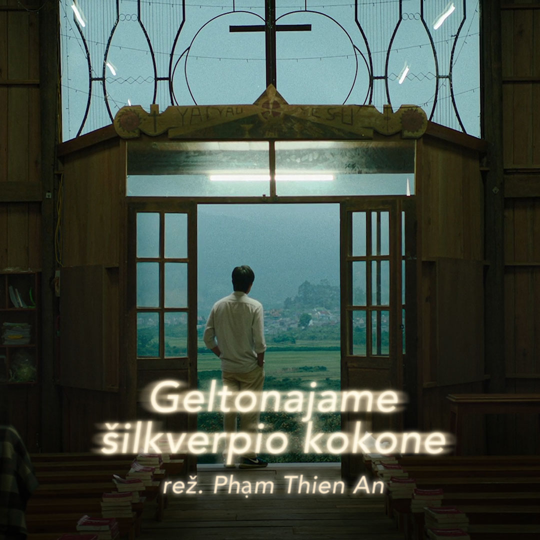
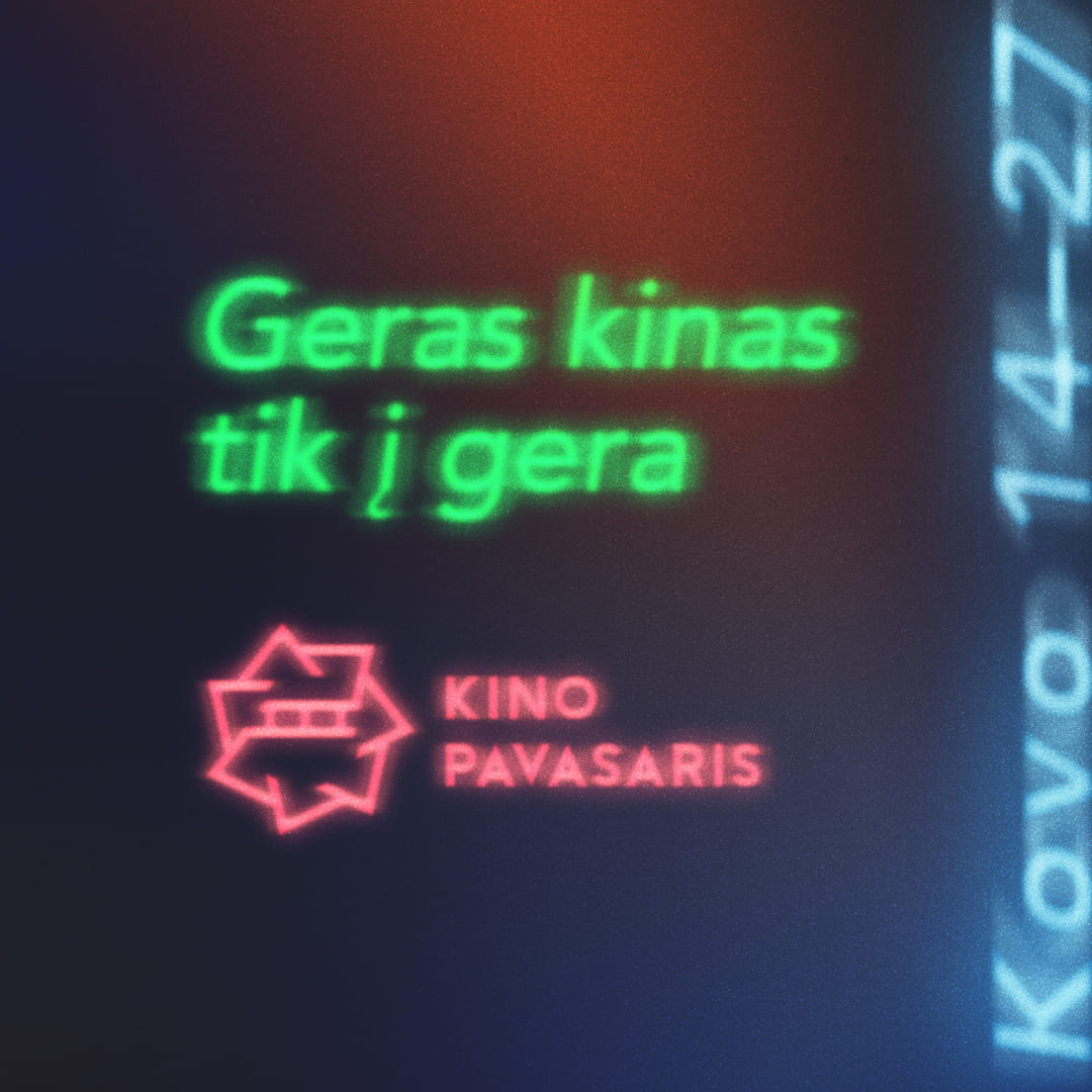
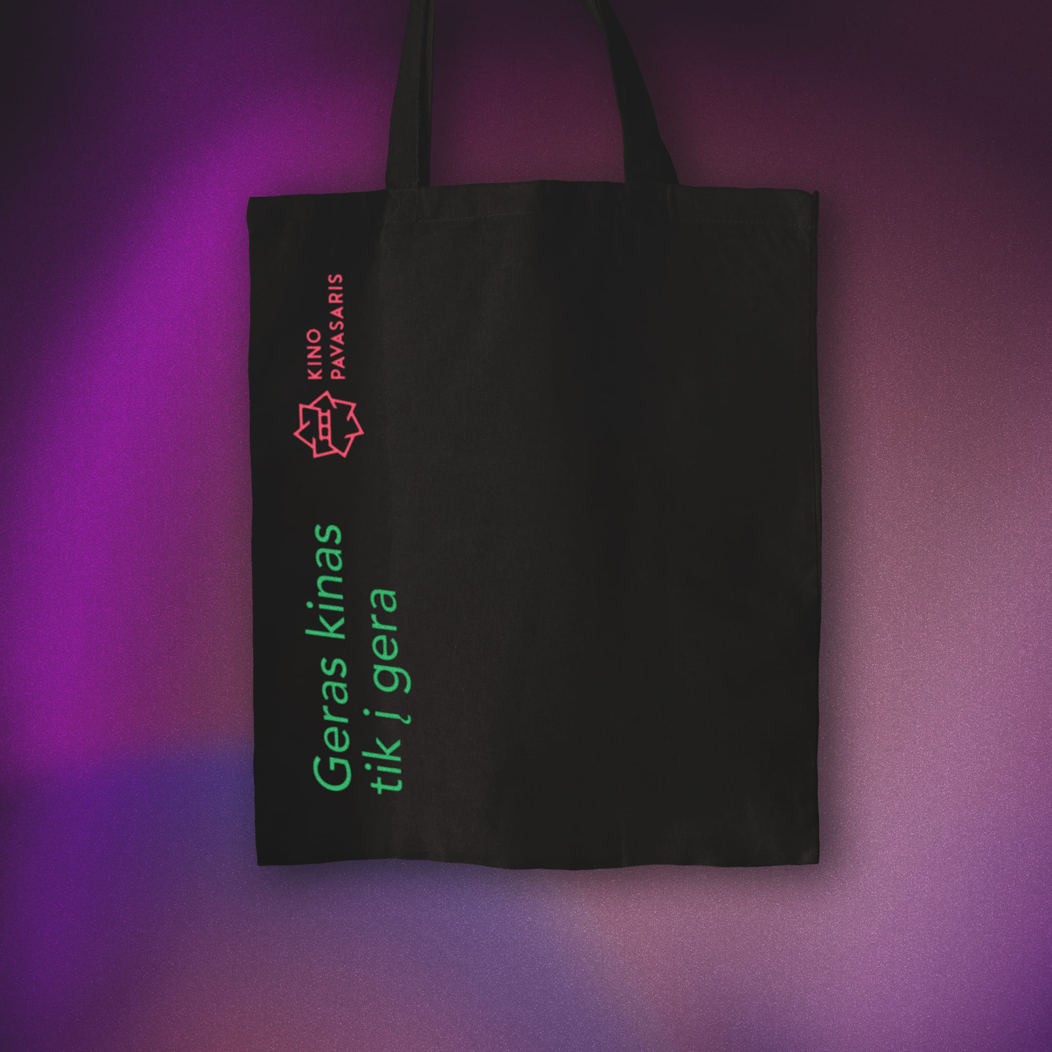
The main festival event ran for two weeks beginning on March 14th. The slogan for its 29th edition was "Good cinema does you good", with the visual identity designed by Regis Pranaitis and Gabriele Monginaite. My responsibility was to adapt the event brand guidelines across various platforms, primarily digital and some print materials. We began promoting the event as early as Christmas. By the start date, we had extensively communicated through social media and ad campaigns, offering early-bird tickets at a reduced price, ticket packages, and invitations to various pre-festival events. Working at the festival was fast-paced, demanding close attention and quick reactions to changes, updates, and other dynamic aspects.